Client: Kuona Engineering
Project: Visual Identity and Website
Year: 2023
Services: Visual, Motion and UI/UX Design
Project: Visual Identity and Website
Year: 2023
Services: Visual, Motion and UI/UX Design
Project Info
Kuona Engineering was established to transform how businesses design and develop products and services with sustainability at the forefront. The company focuses on aligning business practices with natural systems through innovation and data. Their mission is to guide businesses toward a more resource-efficient Circular Economy by providing customized insights, tools, and products. Kuona Engineering aims to inspire and empower clients to adopt circular principles, enhancing profitability, resilience, and responsible resource management.
Creative Rationale
I approached the branding project for Kuona Engineering, I knew it was crucial to create an identity that was both culturally resonant and forward-looking. The name “Kuona,” meaning “to see” or “vision” in Shona, provided a rich starting point. I wanted to ensure that this concept of “vision” transcended the idea of looking forward but also about seeing the interconnectedness between innovation, sustainability, and heritage.
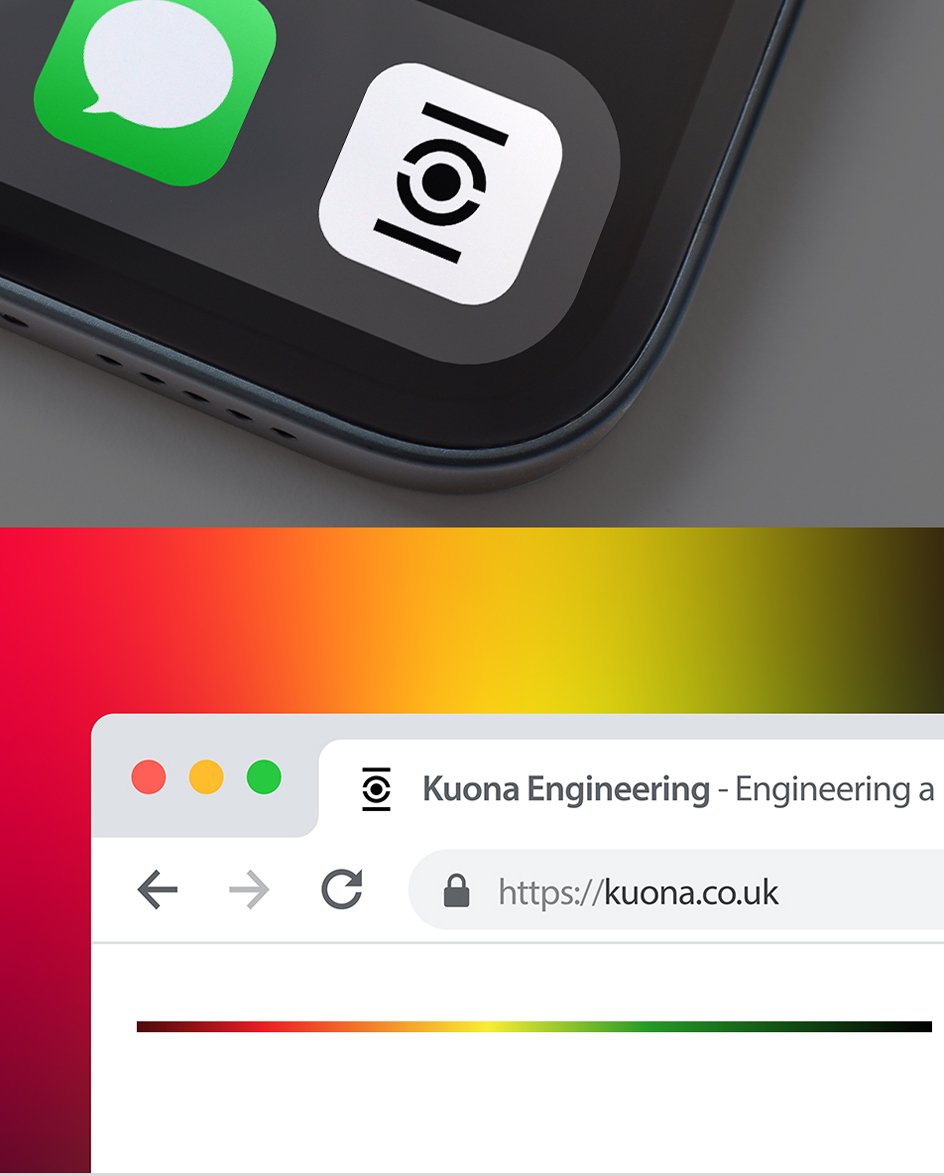
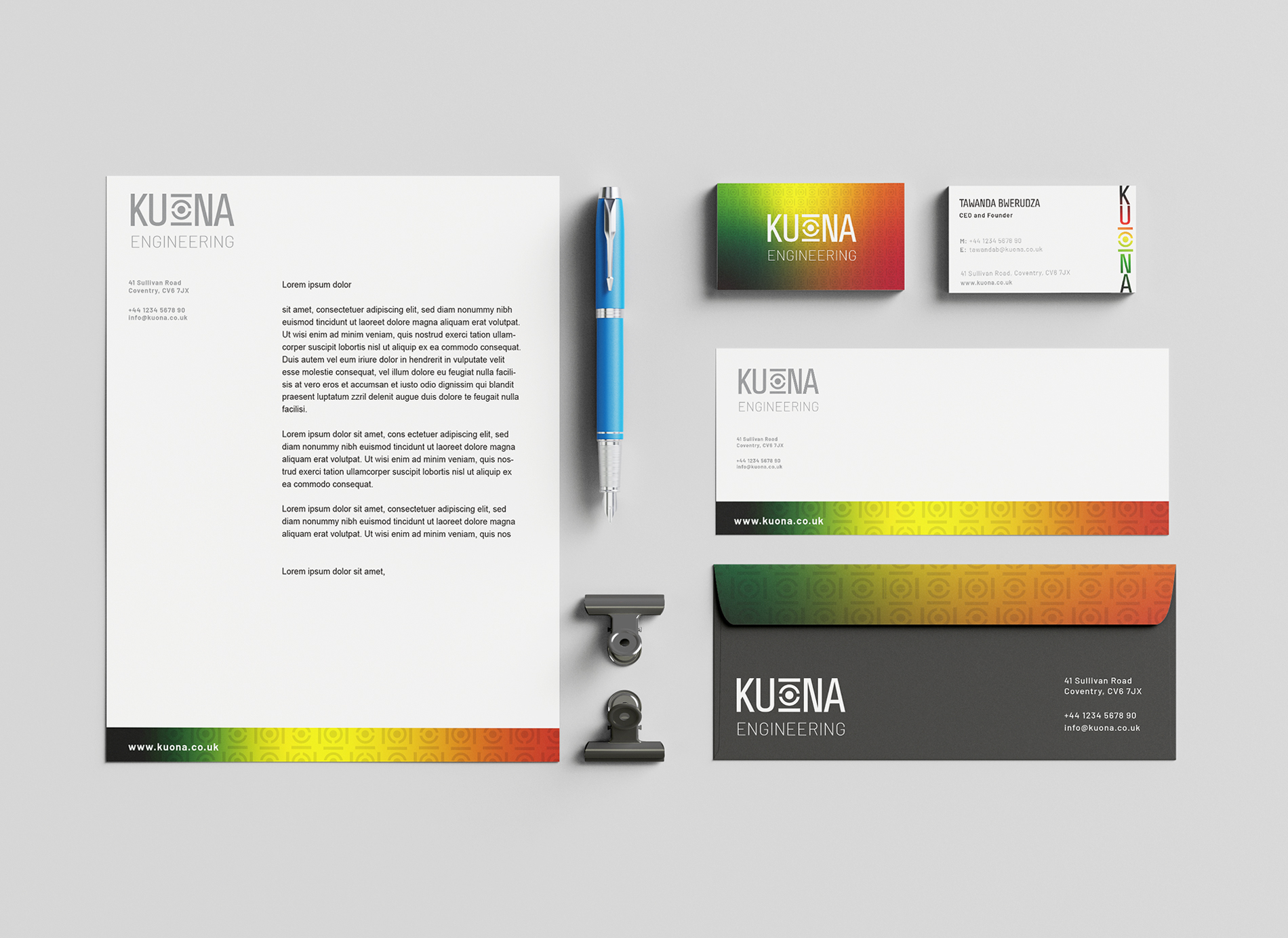
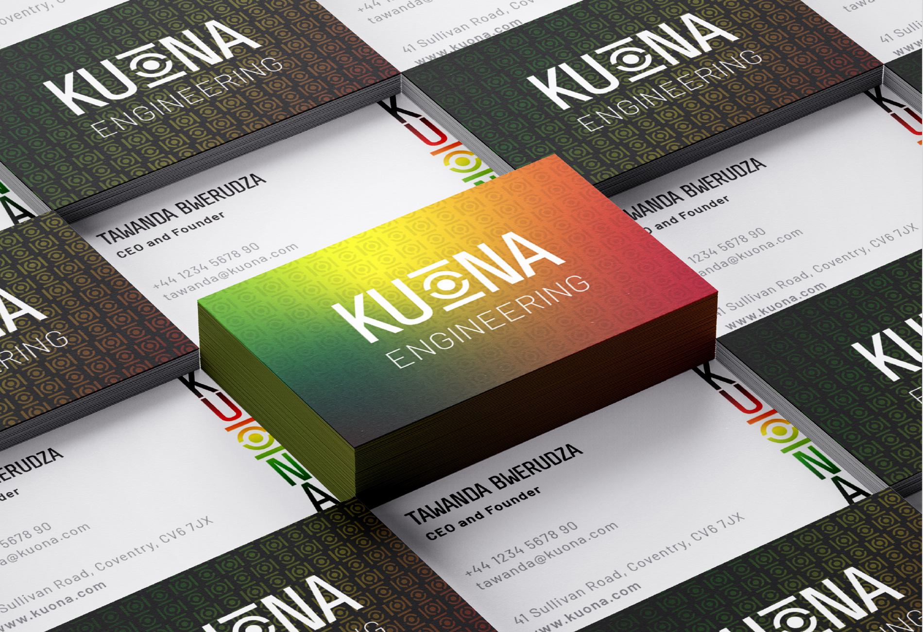
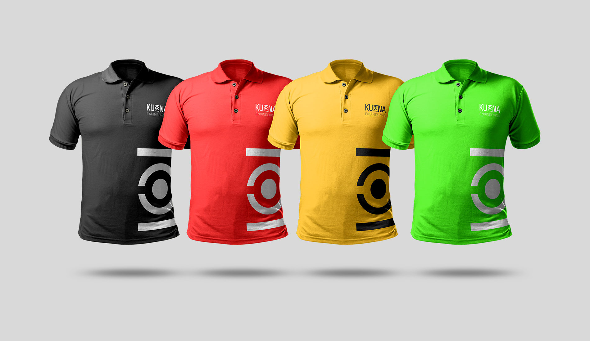
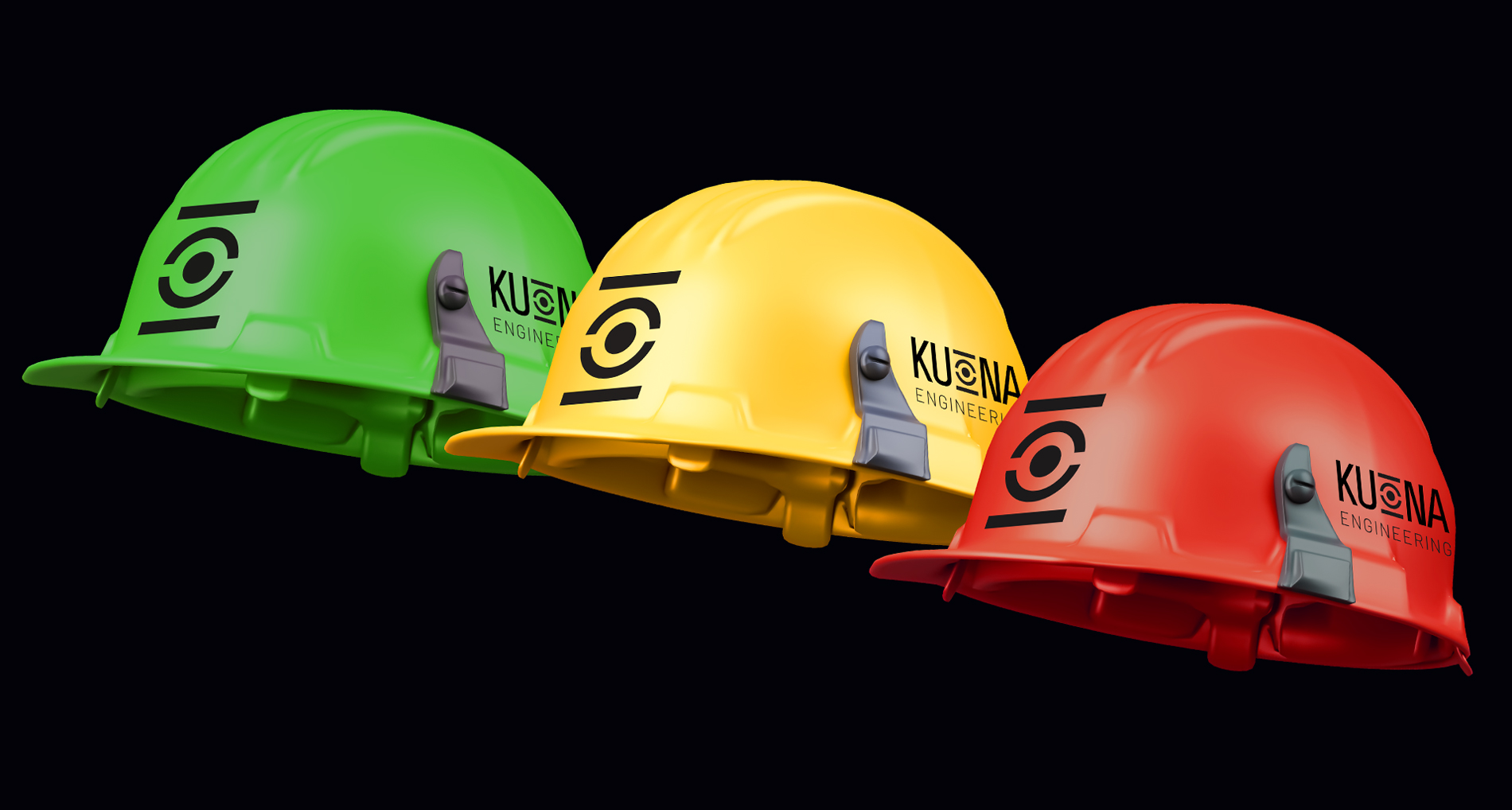
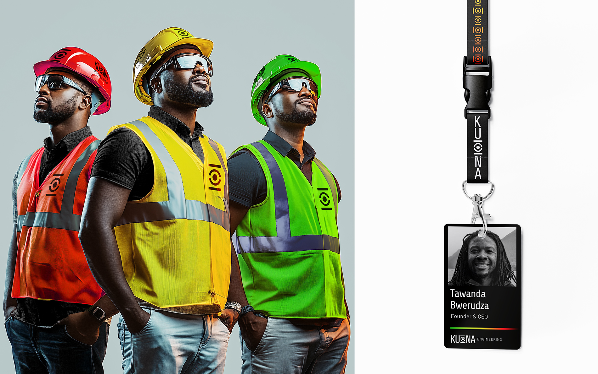
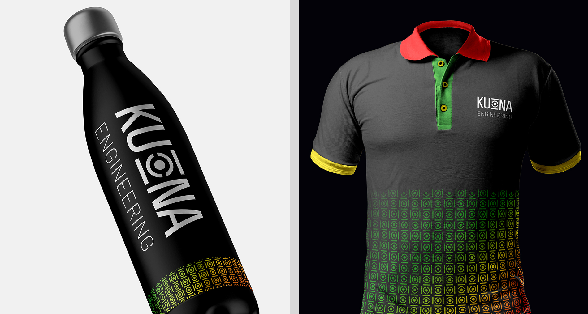
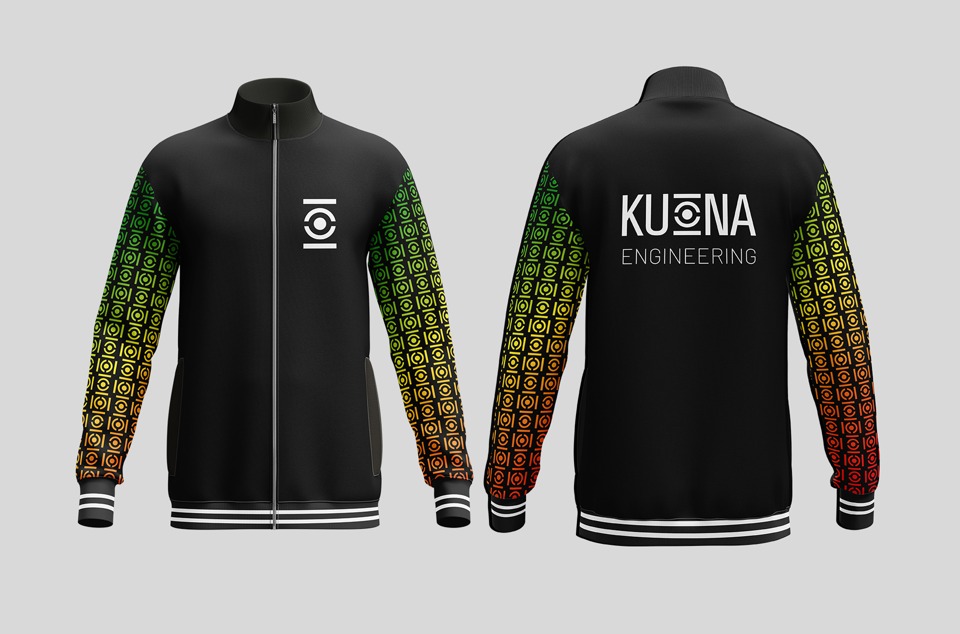
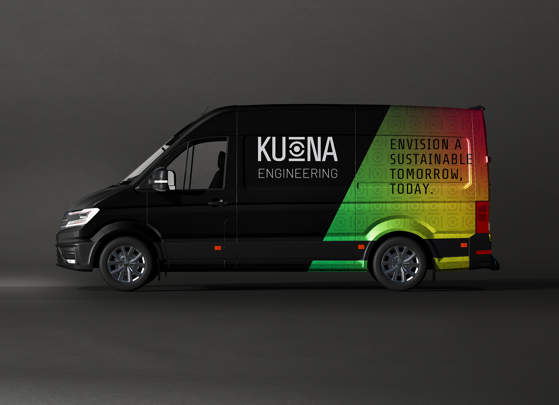
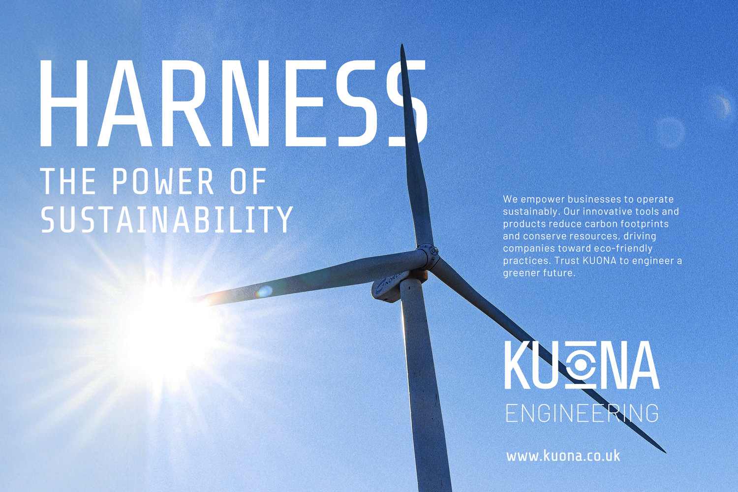
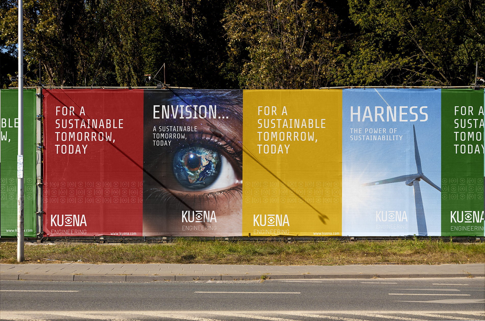
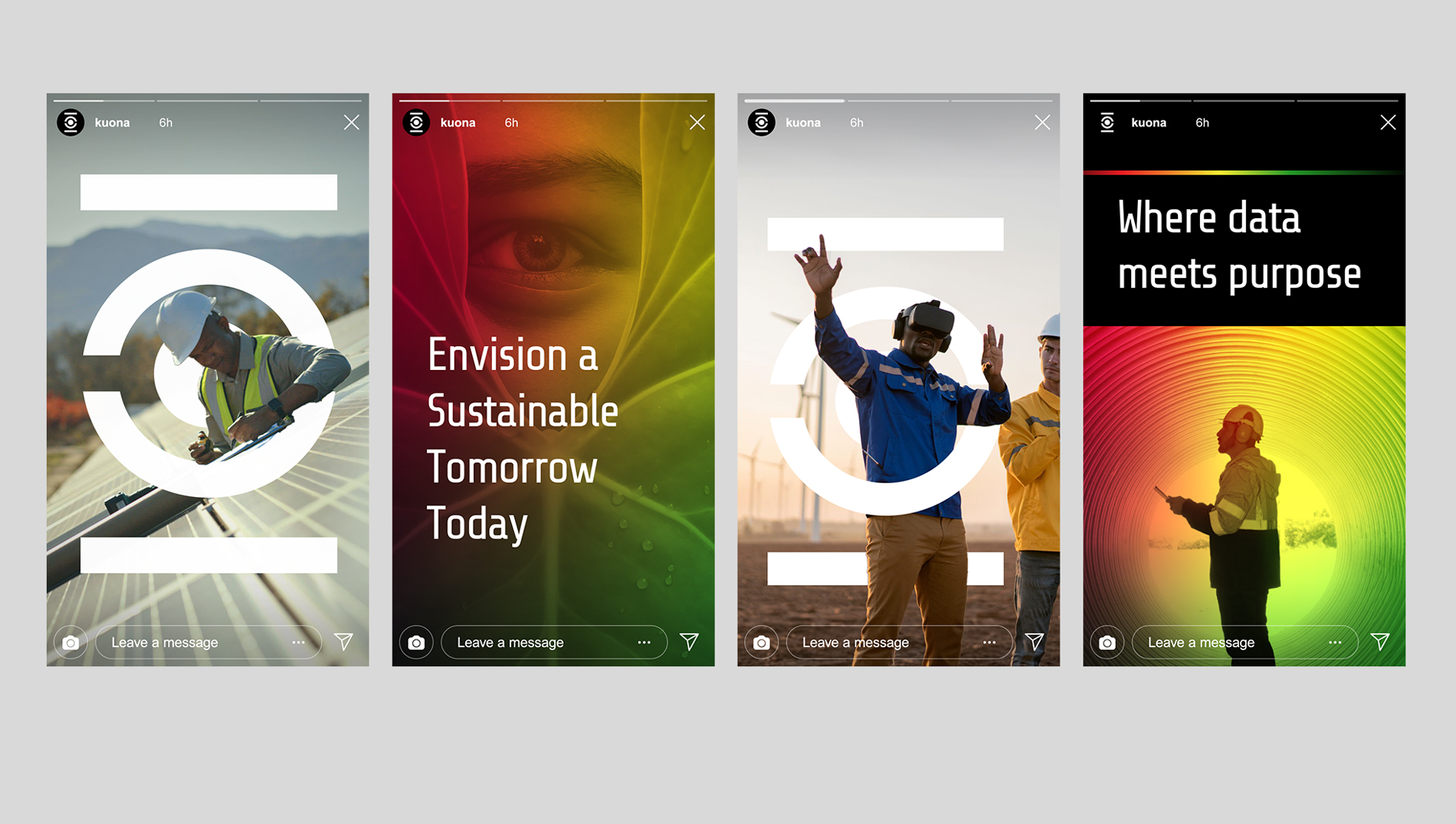
There was a challenge integrating the vibrant colours of the Zimbabwean flag—a palette that can easily overwhelm—into a modern, sophisticated design. I aimed to honour these national colours while avoiding clichés or heavy-handedness. I achieved this by using the colours in a subtle gradient that infused the brand with cultural significance without overpowering the overall aesthetic.
The result is a brand identity that feels both grounded and contemporary. The Zimbabwean flag colours are present but softened, creating a modern look that still pays homage to the brand’s heritage. This balance was key to making the identity feel both unique and globally relevant.

The Logo Idea
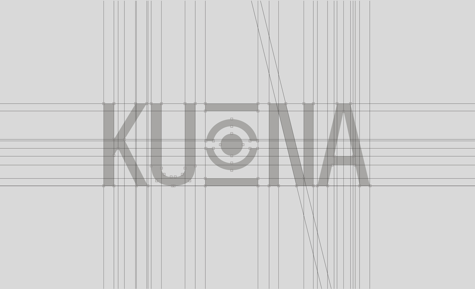
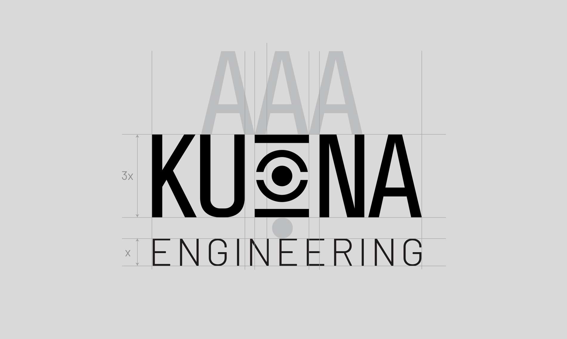
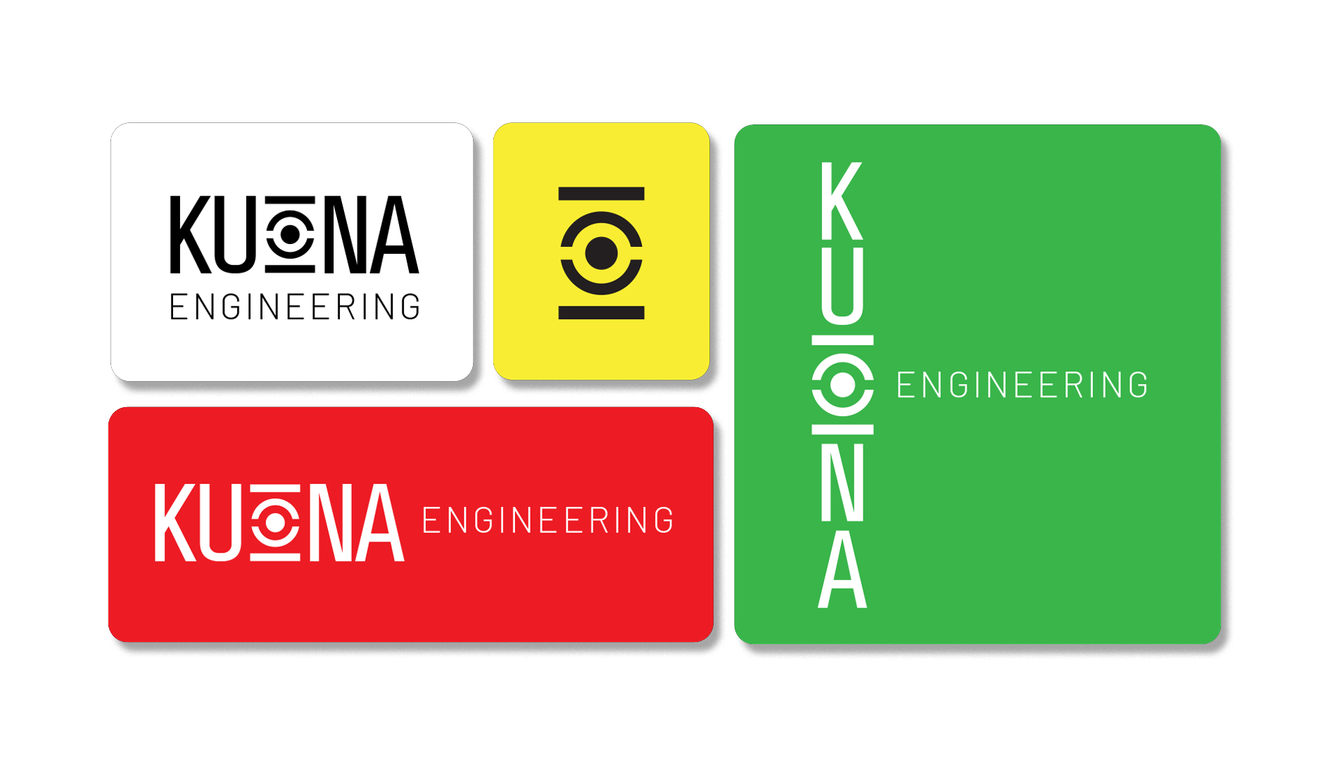
The Kuona Engineering logo draws inspiration from the abstract forms of Shona stone sculptures which are an emblem of the Zimbabwean cultural identity, to honour the organisation’s heritage. The “O” logomark embodies the concept of Reflection and was designed as a reflective element, with vertically symmetrical shapes that evoke the image of a mirror, symbolizing introspection and insight.
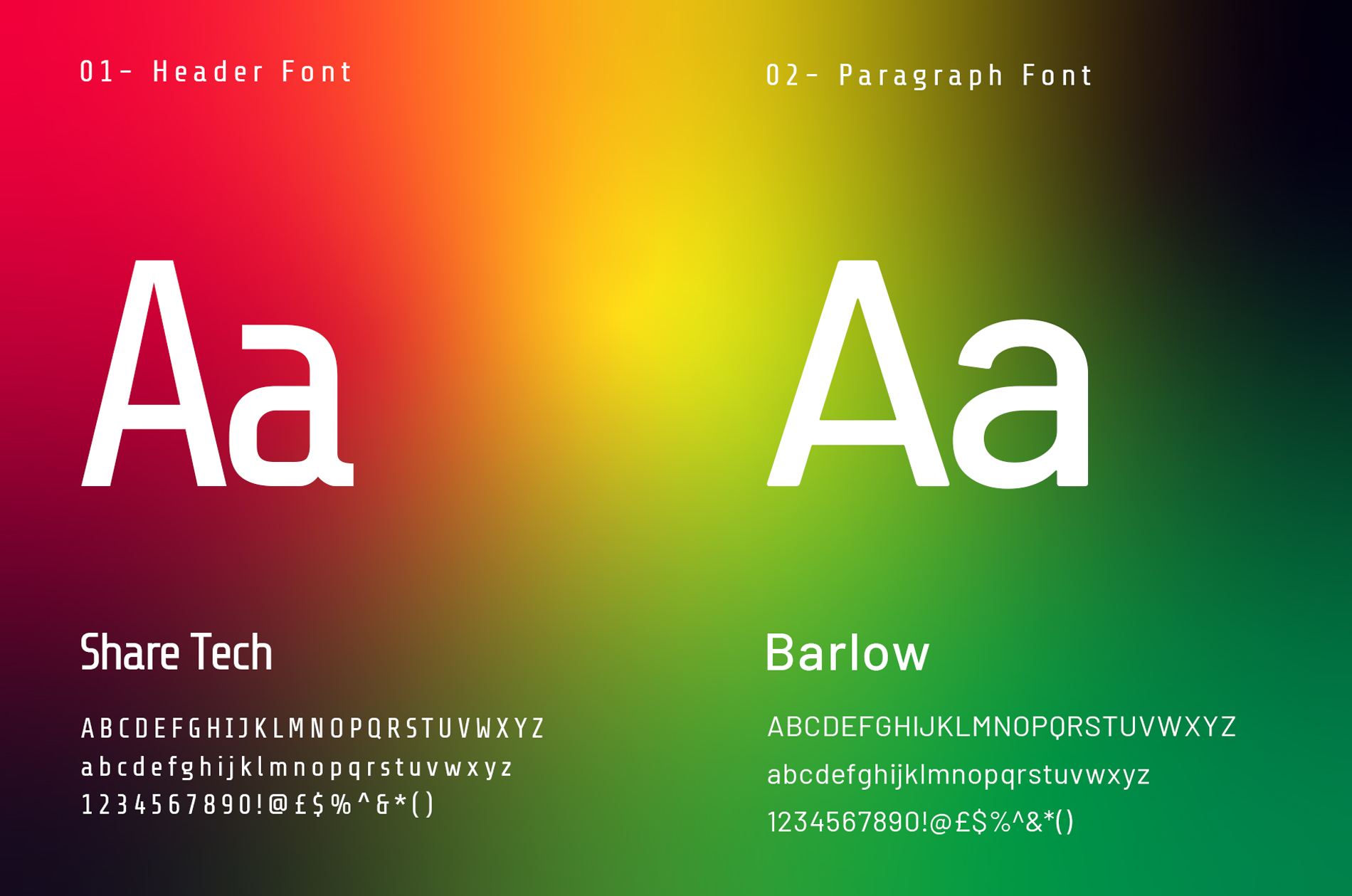
The use of a condensed font adds a tribal, Afrocentric feel, connecting the brand to its cultural roots while offering future branding possibilities, such as creating image frames, patterns, and layout guides.
In the logo and other brand elements use clean lines and minimalistic design to reflect Kuona’s commitment to clarity, innovation, and sustainability. The brand’s visual language is intentionally simple, allowing the powerful concept of vision and interconnectedness to take center stage.





The Website
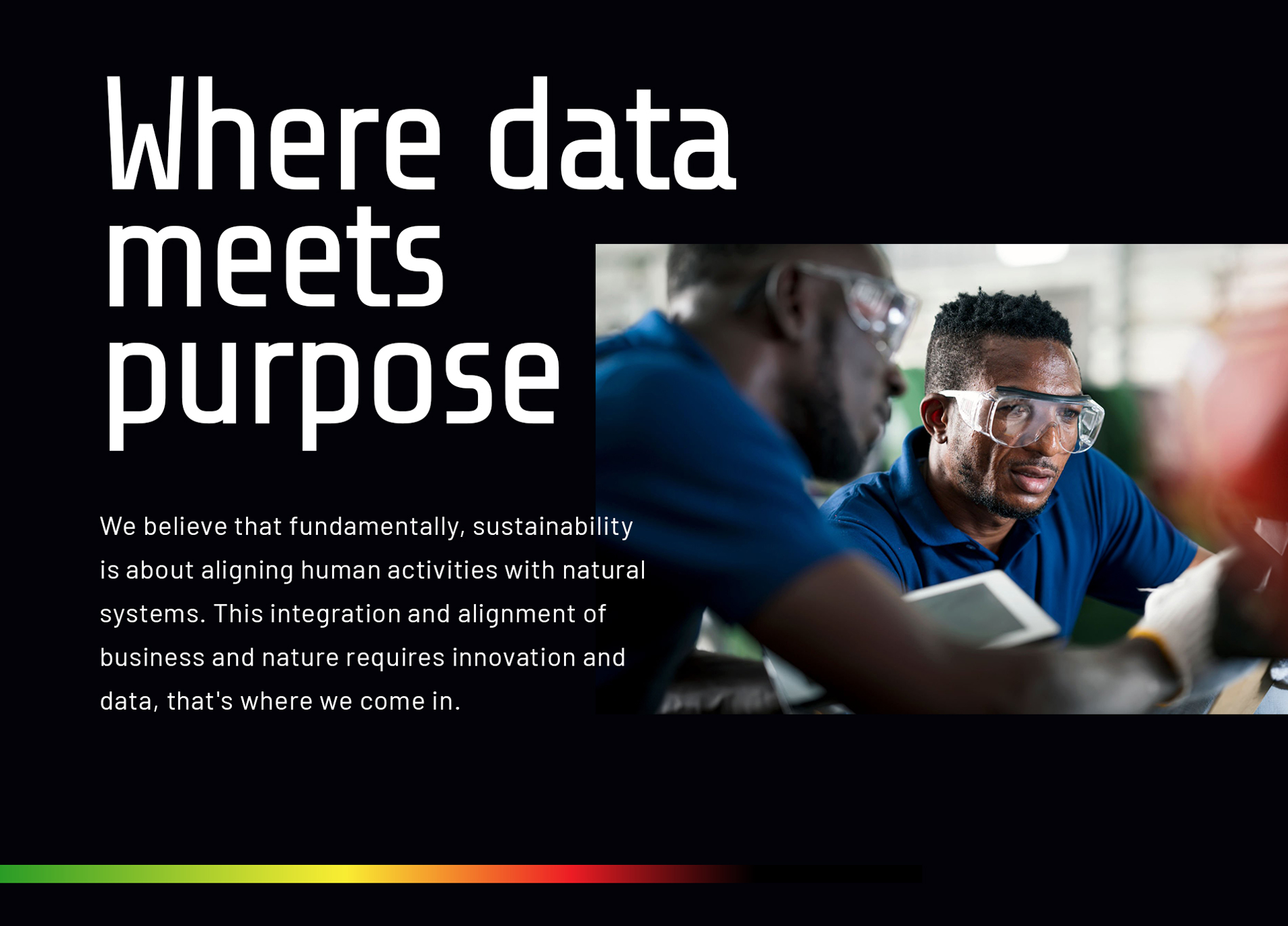
The Kuona Engineering website is a visually cohesive one-page design that aligns perfectly with the brand’s minimalist and culturally resonant visual identity. The choice of a single-page layout reflects the brand’s emphasis on clarity and focus, mirroring its commitment to streamlined, efficient processes in both design and operation. This format allows for a seamless narrative flow, guiding visitors through the company’s vision, services, and values without unnecessary distractions.
The clean, modern aesthetic, combined with subtle uses of the vibrant Zimbabwean flag colors, ensures that the website is both functionally efficient and culturally meaningful, creating an engaging and immersive experience for the user. For prospective investors, this design underscores Kuona Engineering’s dedication to innovation, strategic clarity, and a strong connection to its cultural roots, showcasing its potential for growth and market impact.
